Xiabuting: Taiwan Fried Food Rebranding Design
呷不停:台湾炸货品牌形象升级
-
Branding & Visual Identity
-
Year: 2022
呷不停:台湾炸货品牌形象升级
-
Branding & Visual Identity
-
Year: 2022
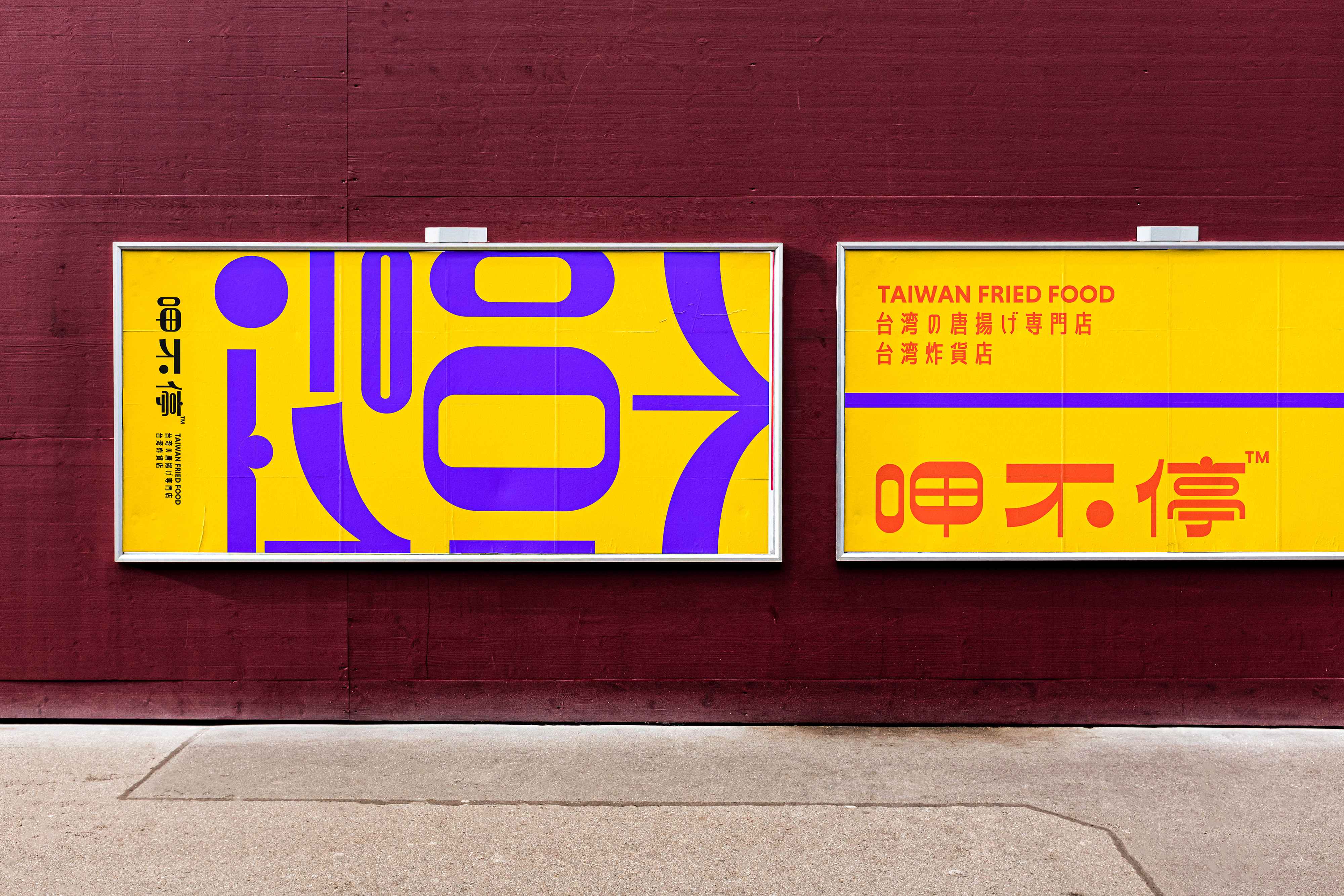
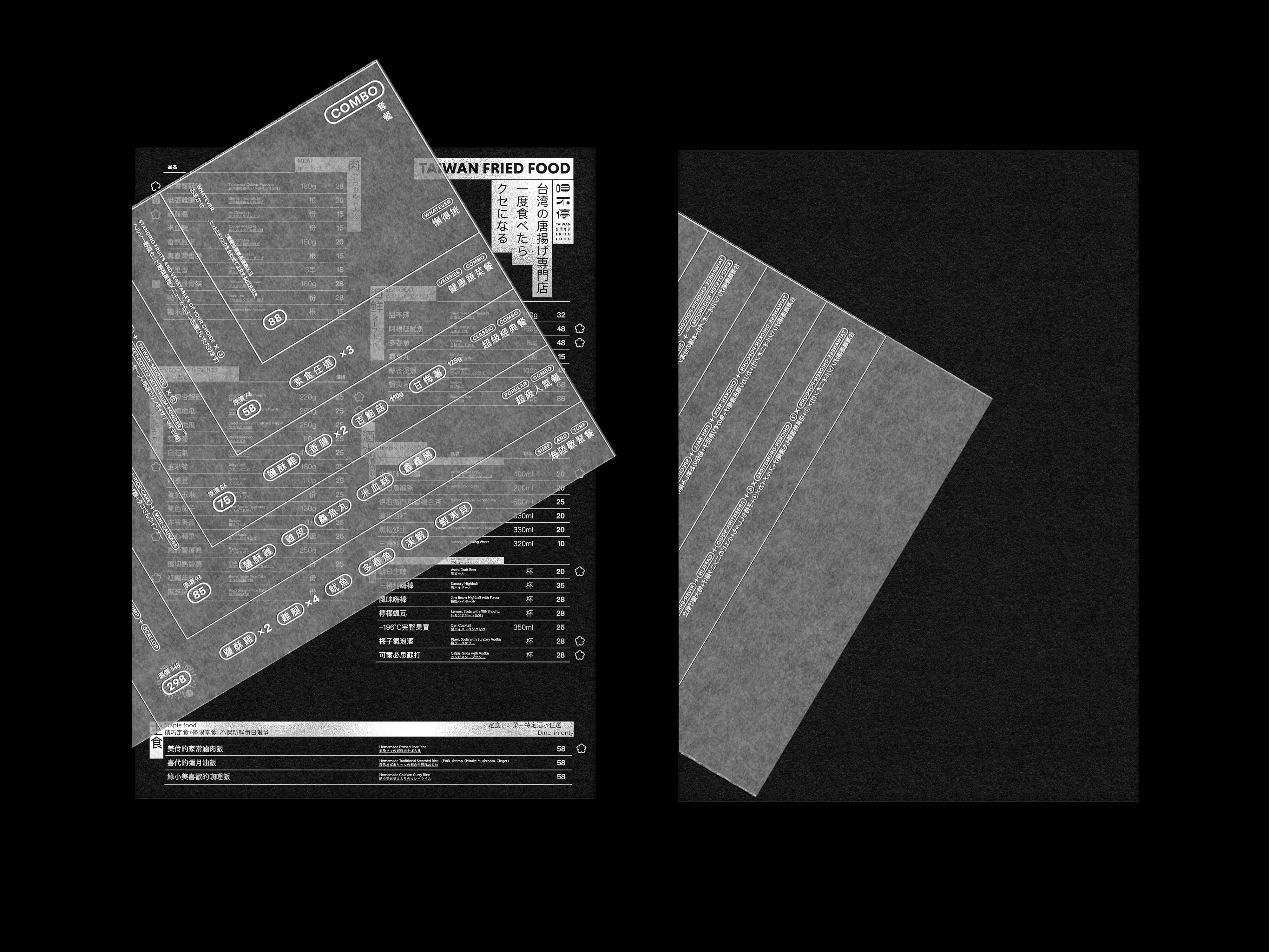
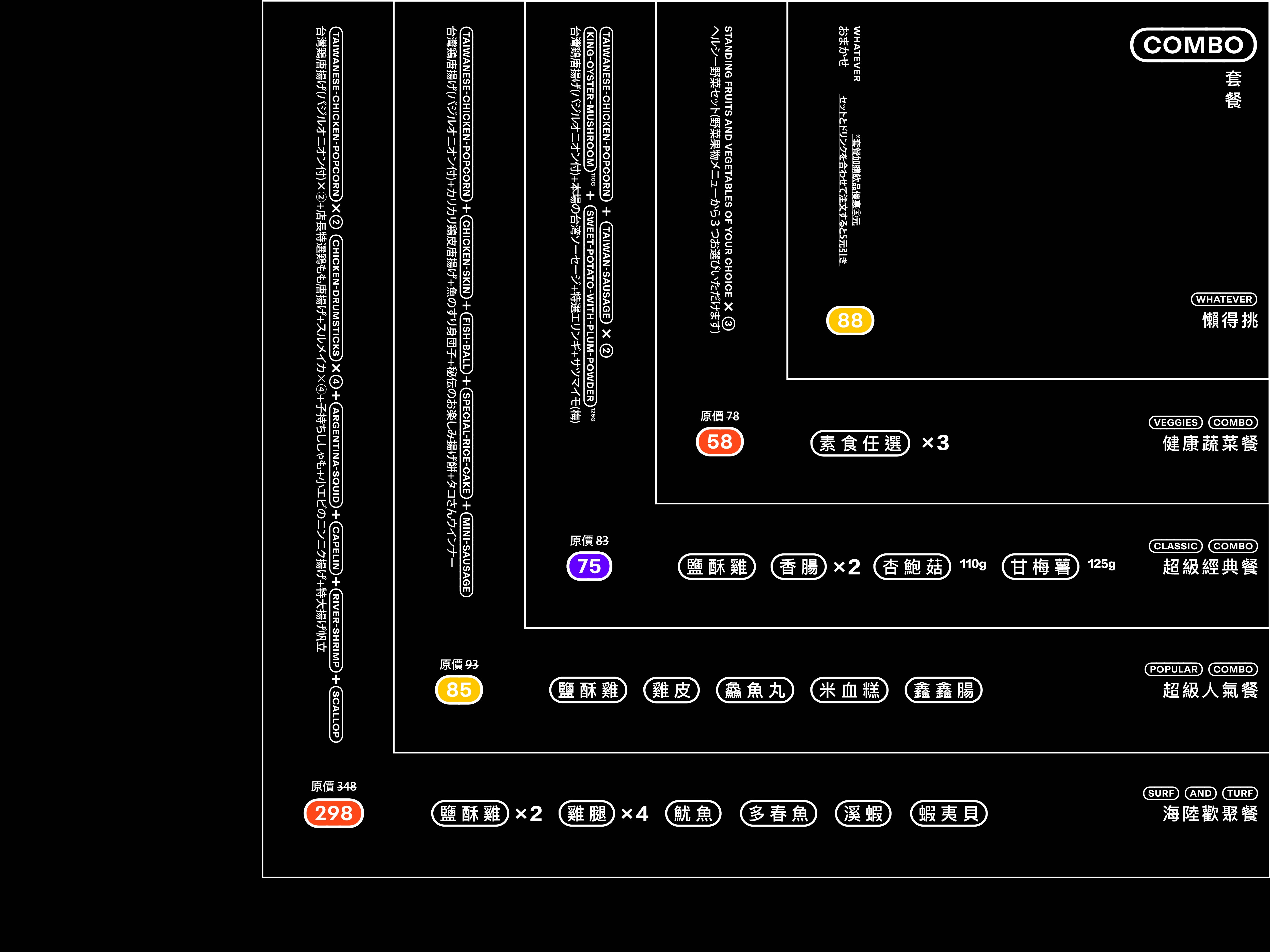
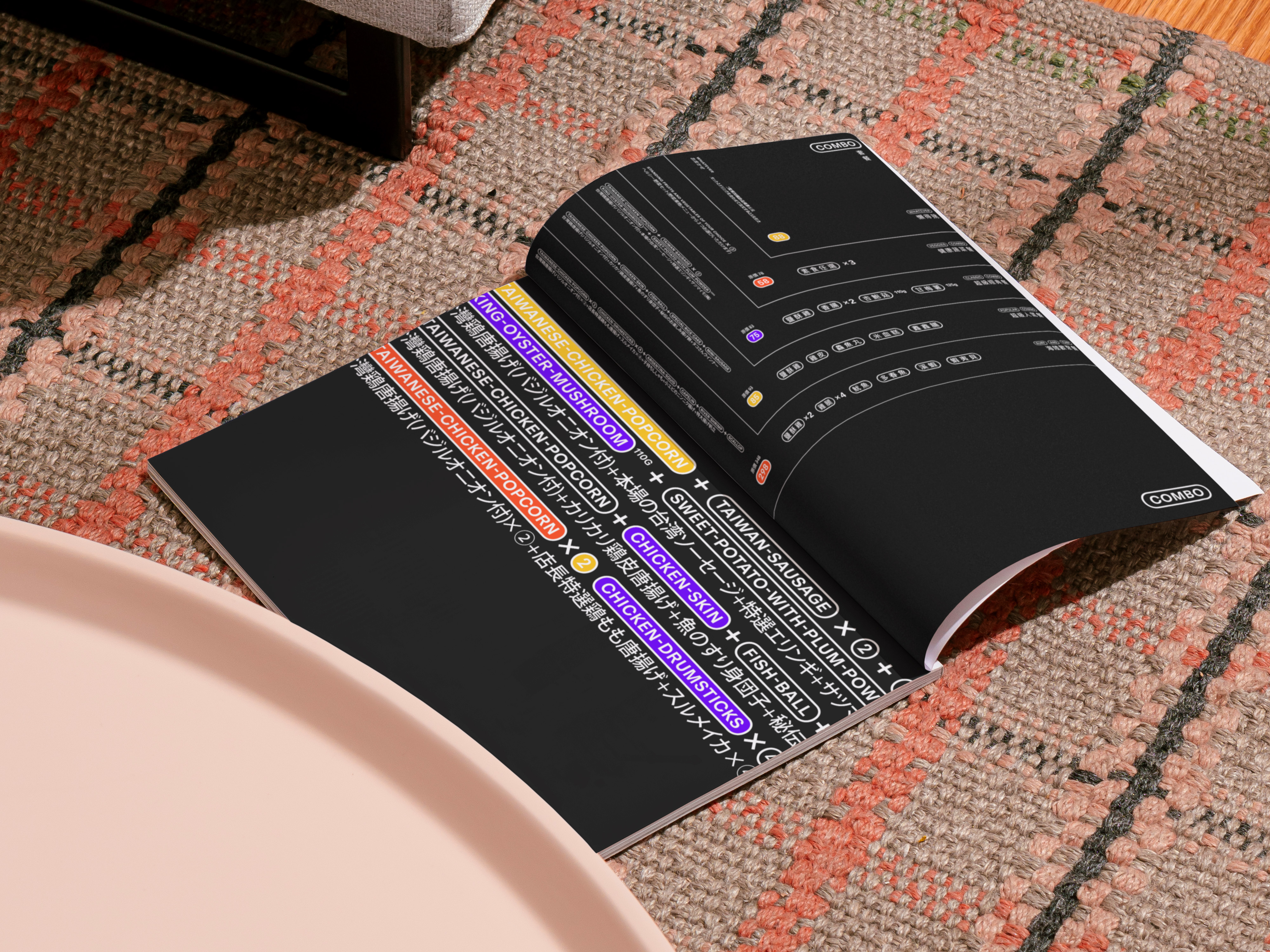
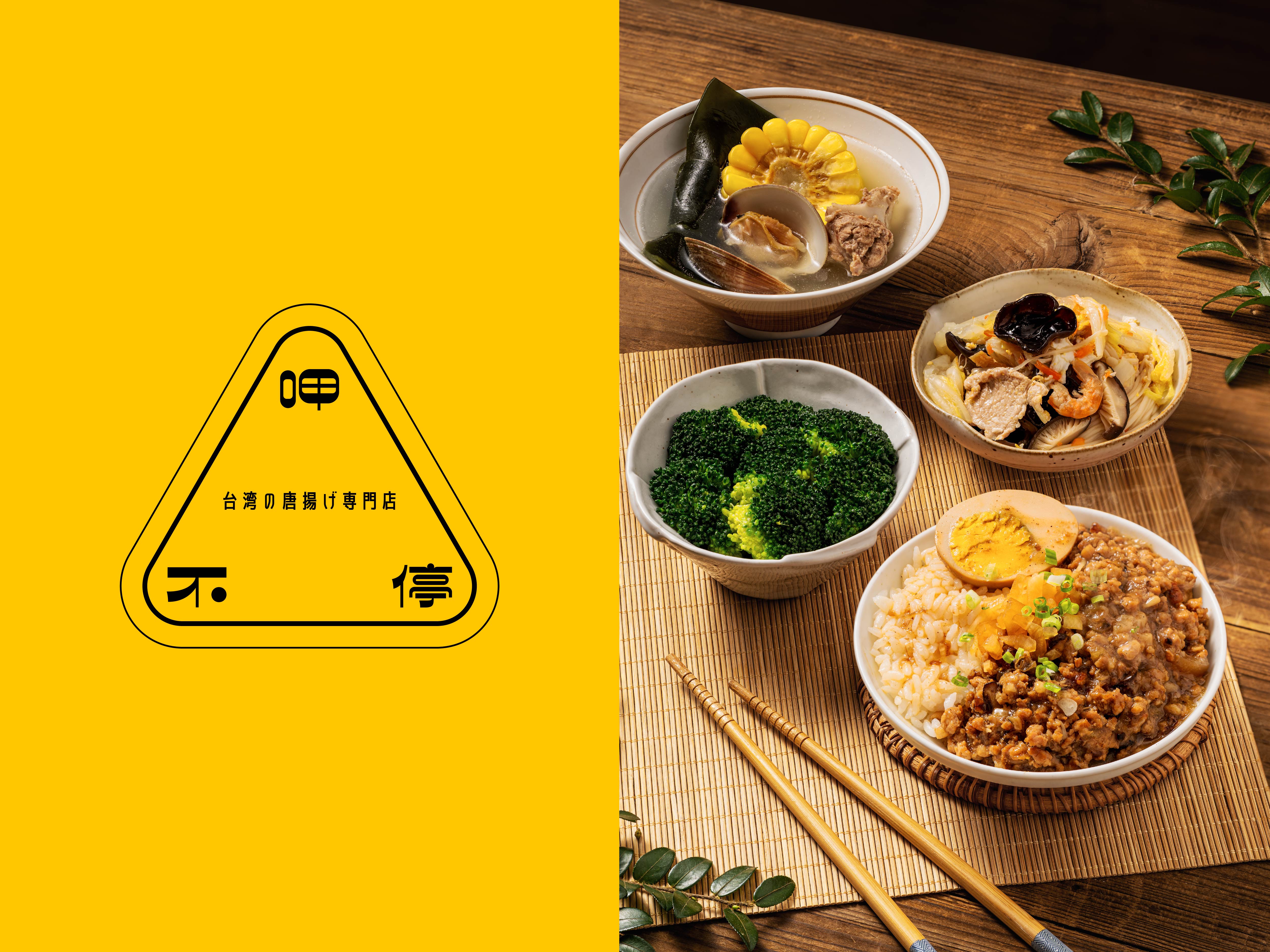
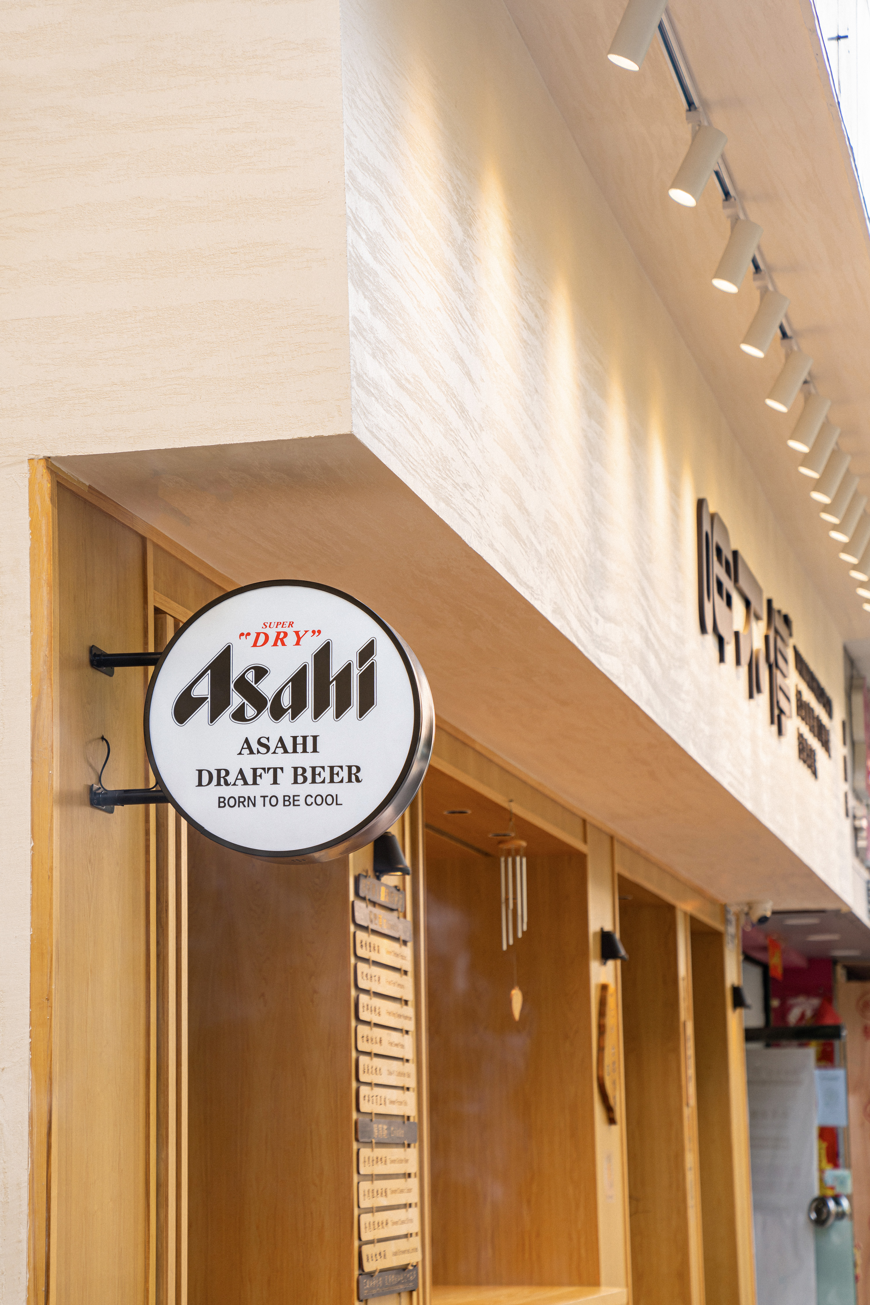
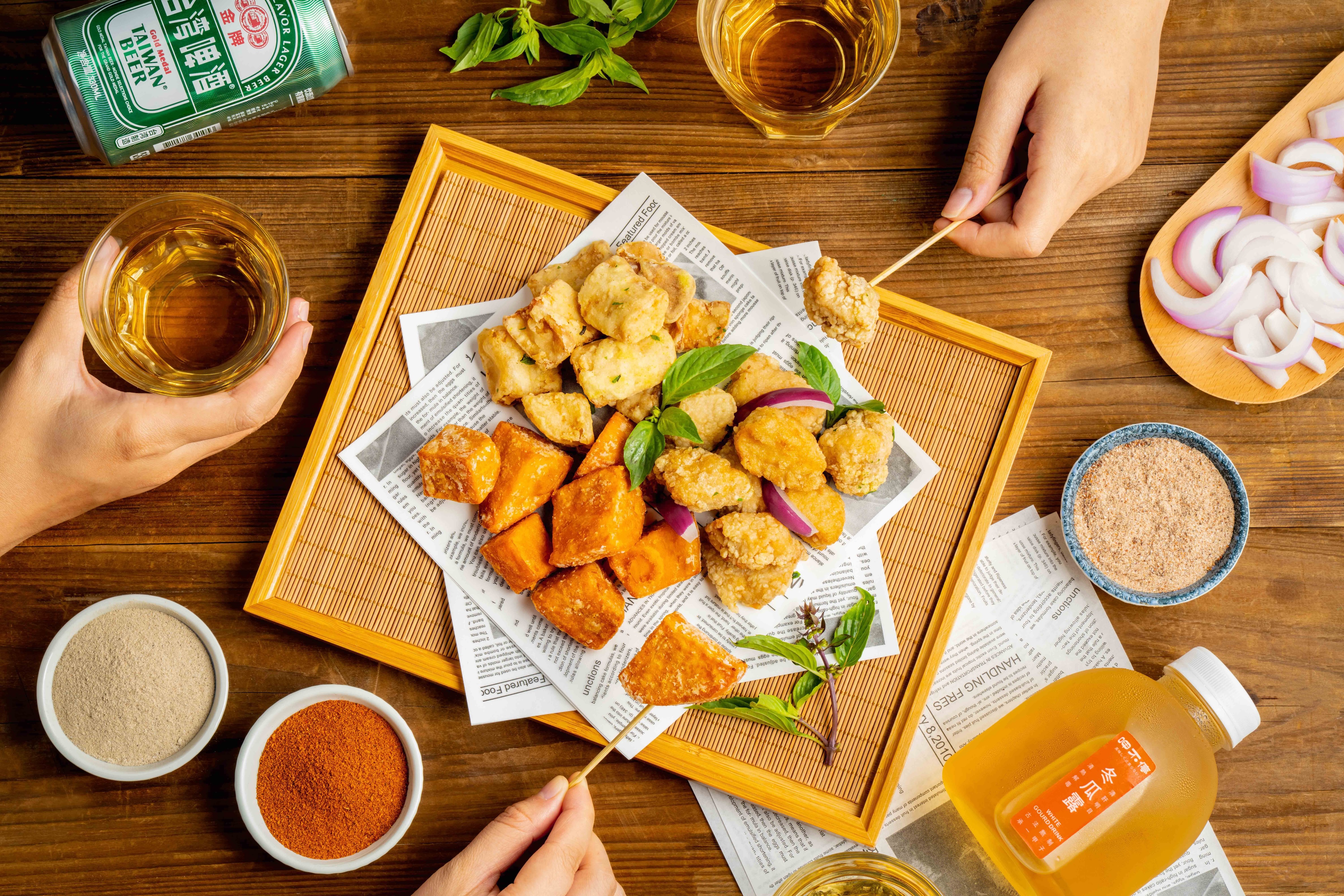
呷不停,一家承载着三代人记忆的台湾炸货品牌,从1985年苗栗街头的小店起步,至今始终坚守着传统的台湾风味和制作工艺,以新鲜食材和独特配方,为顾客带来香脆可口、鲜香诱人的炸货美味。那份熟悉的味道,如同孩童时代记忆中的街头小吃,是温暖的回忆,是难以割舍的乡愁。如今,呷不停踏上了新的征程,将目光投向广阔的大陆市场,希望将来自宝岛的热情与活力传递给更多消费者,让更多人感受到这份记忆中的味道,体验这份来自台湾的温暖。为了与大陆消费者建立更紧密的沟通和联系,我们进行了品牌形象的升级,力求在保留品牌传统的同时,注入新的能量。
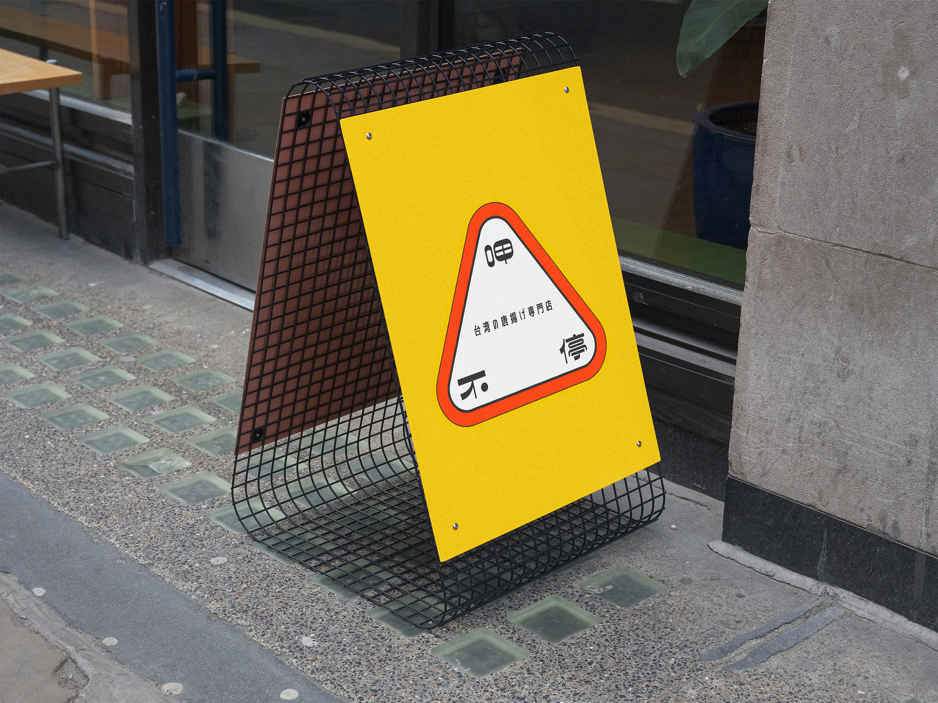
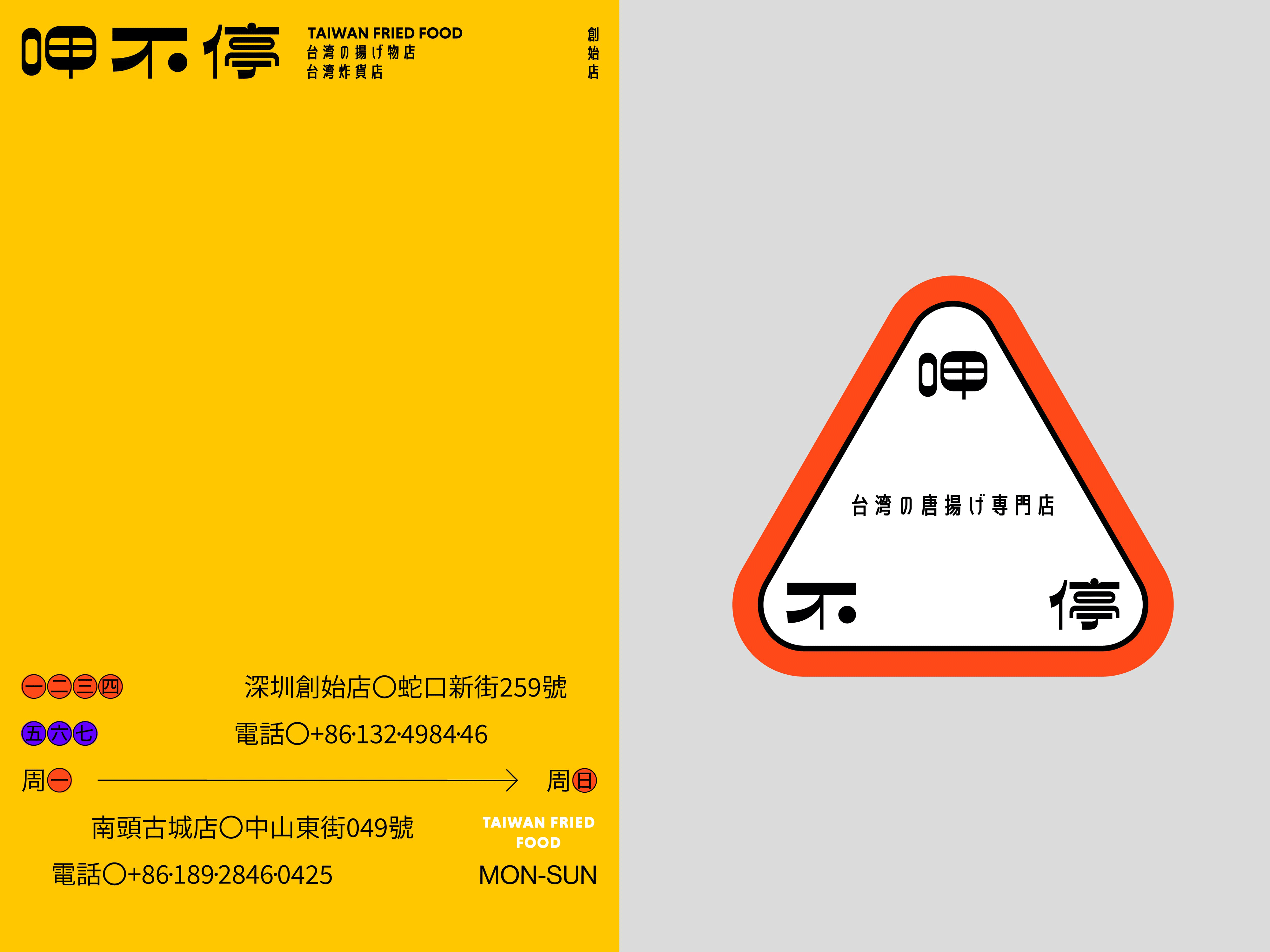
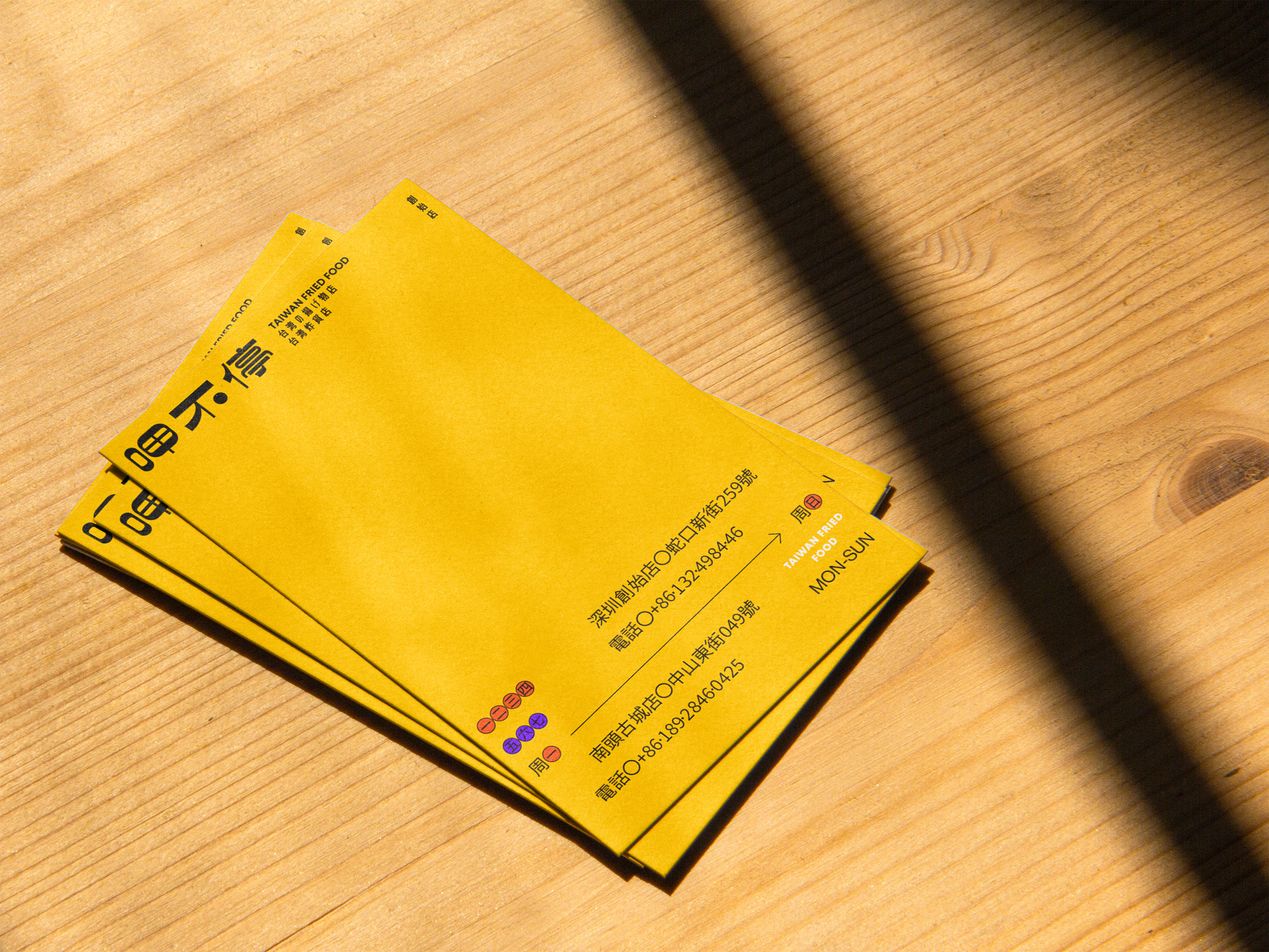
呷不停的品牌创始人曾经在日本生活多年,而且创始店位于深圳的外国人聚居区,因此我们的品牌也吸引了不少日本客户。因此,我们希望通过多语言的设计策略,让不同文化背景的消费者都能轻松理解和感受品牌信息,让“呷不停”成为一个跨越国界和文化的品牌。
Xiabuting, a Taiwan fried food brand with a history spanning three generations, has been a beloved local institution since its humble beginnings in a small shop on the streets of Miaoli in 1985. Its commitment to traditional Taiwanese flavors and techniques, combined with fresh ingredients and unique recipes, has brought a unique blend of crispy textures and savory aromas to customers for decades. That familiar taste, reminiscent of childhood street food, evokes warm memories and a sense of nostalgia for many. Xiabuting’s founder, who lived in Japan for many years, and the brand's original shop in Shenzhen, a foreigner-populated area, have attracted a significant Japanese clientele. To ensure easy recognition and understanding for diverse language groups, the brand has adopted a multi-language design strategy incorporating Japanese, Chinese, and English. This bridges the language barrier, allowing customers from different countries to experience the appeal of Xiabuting.
Xiabuting, a Taiwan fried food brand with a history spanning three generations, has been a beloved local institution since its humble beginnings in a small shop on the streets of Miaoli in 1985. Its commitment to traditional Taiwanese flavors and techniques, combined with fresh ingredients and unique recipes, has brought a unique blend of crispy textures and savory aromas to customers for decades. That familiar taste, reminiscent of childhood street food, evokes warm memories and a sense of nostalgia for many. Xiabuting’s founder, who lived in Japan for many years, and the brand's original shop in Shenzhen, a foreigner-populated area, have attracted a significant Japanese clientele. To ensure easy recognition and understanding for diverse language groups, the brand has adopted a multi-language design strategy incorporating Japanese, Chinese, and English. This bridges the language barrier, allowing customers from different countries to experience the appeal of Xiabuting.