Refold Reform Chocolate
重新折叠巧克力品牌设计&包装设计
-
Packaging & Branding
-
Year: 2021
重新折叠巧克力品牌设计&包装设计
-
Packaging & Branding
-
Year: 2021
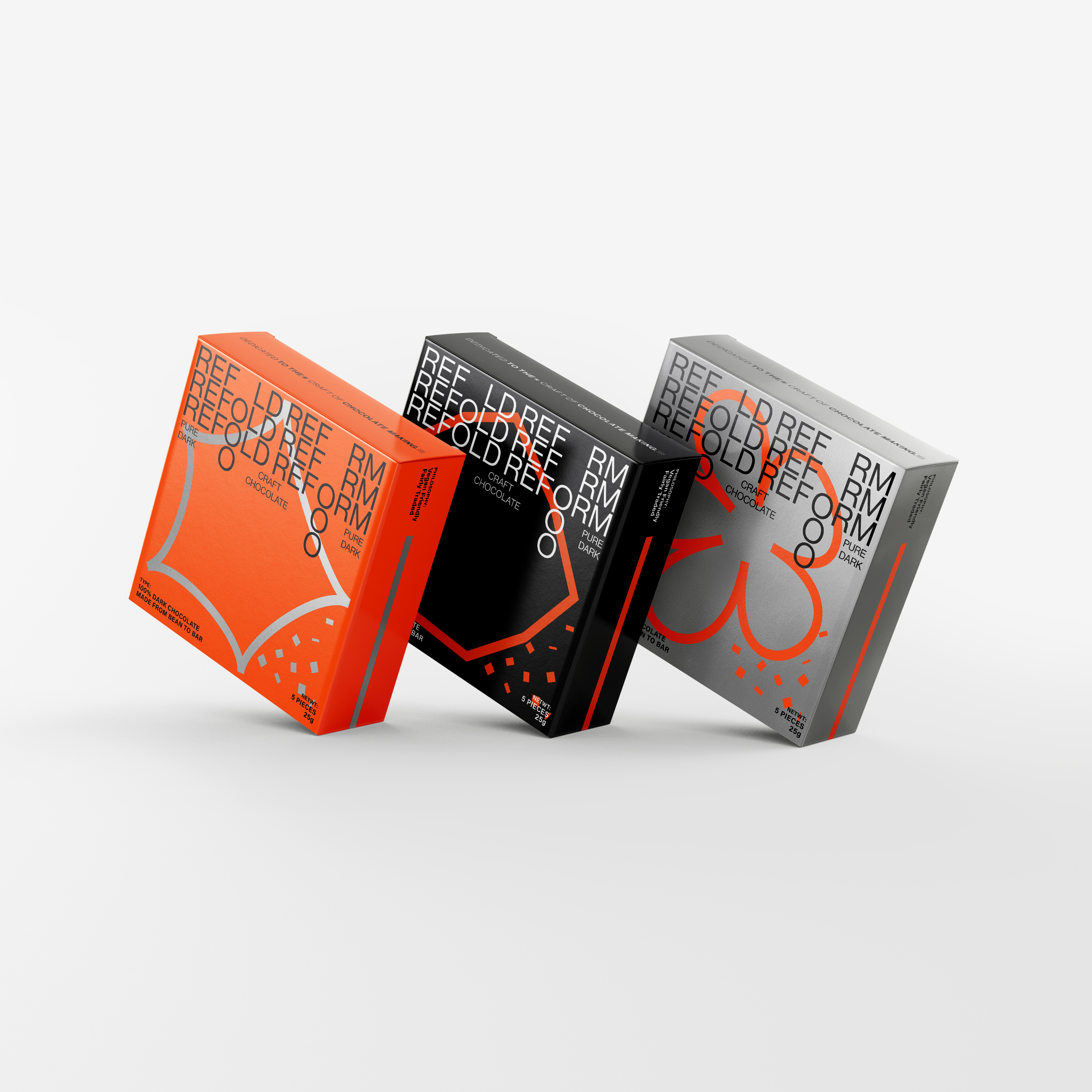
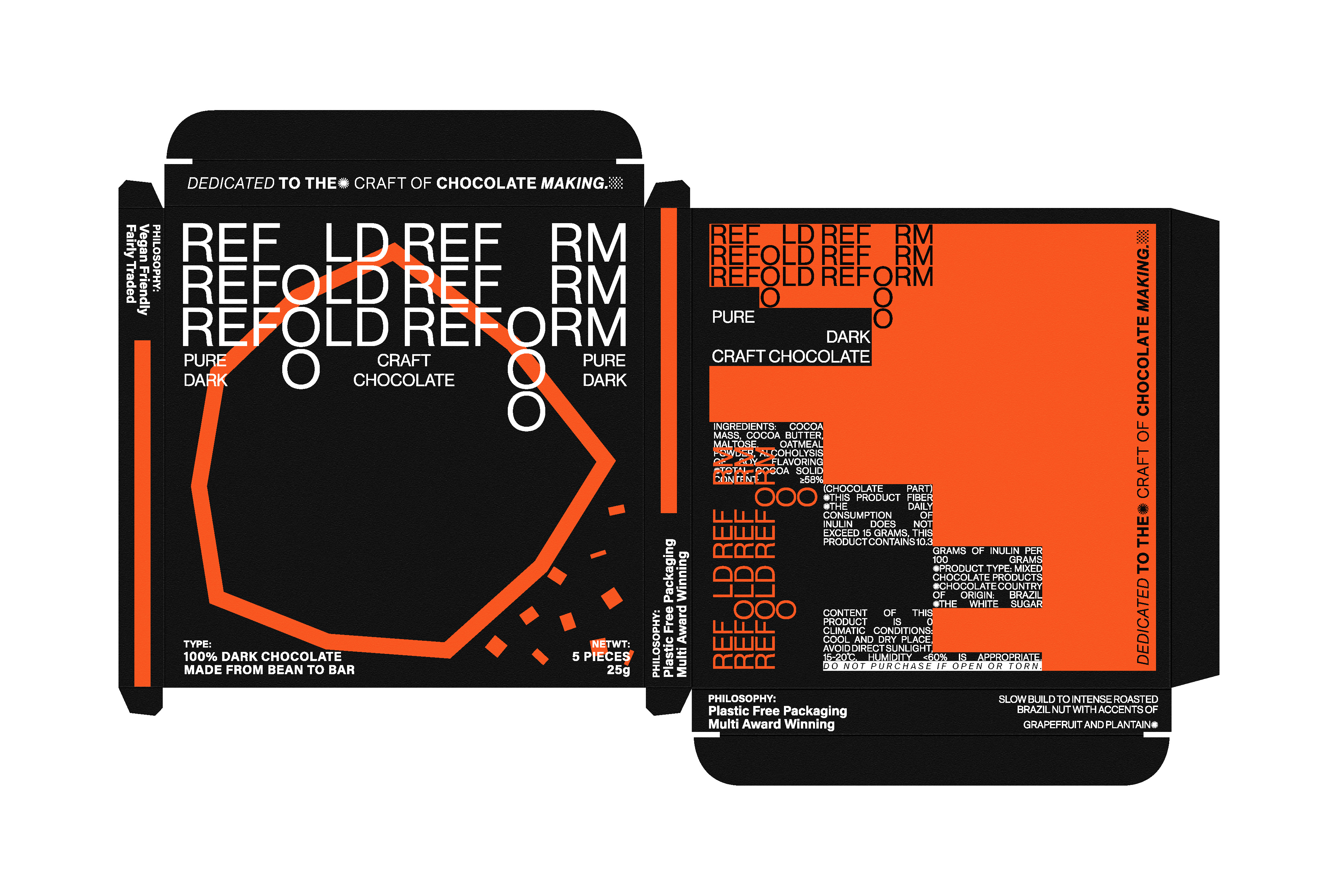
“RE”永远意味着更新。品牌本身具有活力和生命力,因此在设计中对文字的布局进行了一些非常规的处理。它不仅希望呈现出相对较新的视觉特征,而且希望通过视觉效果使人们产生动态联想,从而与生命力和活力联系起来。在平面构成的主图上,通过模拟巧克力片的几何图形来表达“FOLD”的概念和作用以及产品类别的特征表达。背面的排列不仅模拟了巧克力的几何形状,而且还略有不同。方式来表达这个包裹的意图在巧克力类别“改革”。
"RE" always means renewal. The brand itself has a sense of vigor and vitality, so some unconventional treatments have been done to the layout of the text in the design. In addition to staggering the O word, it hopes to present relatively new visual features, but also hope that it can be related to vitality and vitality through the visual effects that make people produce dynamic associations. On the main graphic of the plane composition, the concept and action of "FOLD" and the characteristic expression of the product category are conveyed by simulating the geometrical figure of chocolate chips. The arrangement on the back side is not only simulating the geometric form of chocolate, but also is slightly different. Way to express the intention of this package in the chocolate category "REFORM".