The World, Reimagined
109-A Universala Kongreso de Esperanto Brand Visual
世界,重新想象:第109届世界语大会视觉设计
-
Visual Identity & Font
-
Year: 2024
109-A Universala Kongreso de Esperanto Brand Visual
世界,重新想象:第109届世界语大会视觉设计
-
Visual Identity & Font
-
Year: 2024
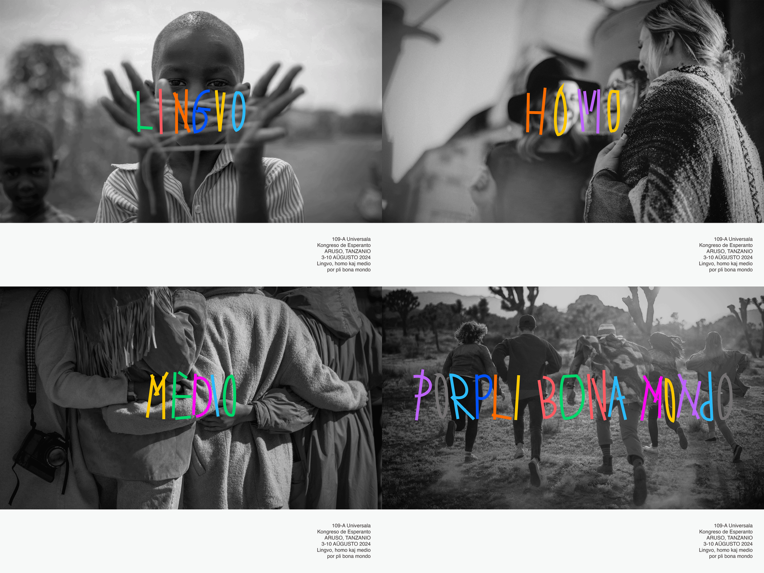
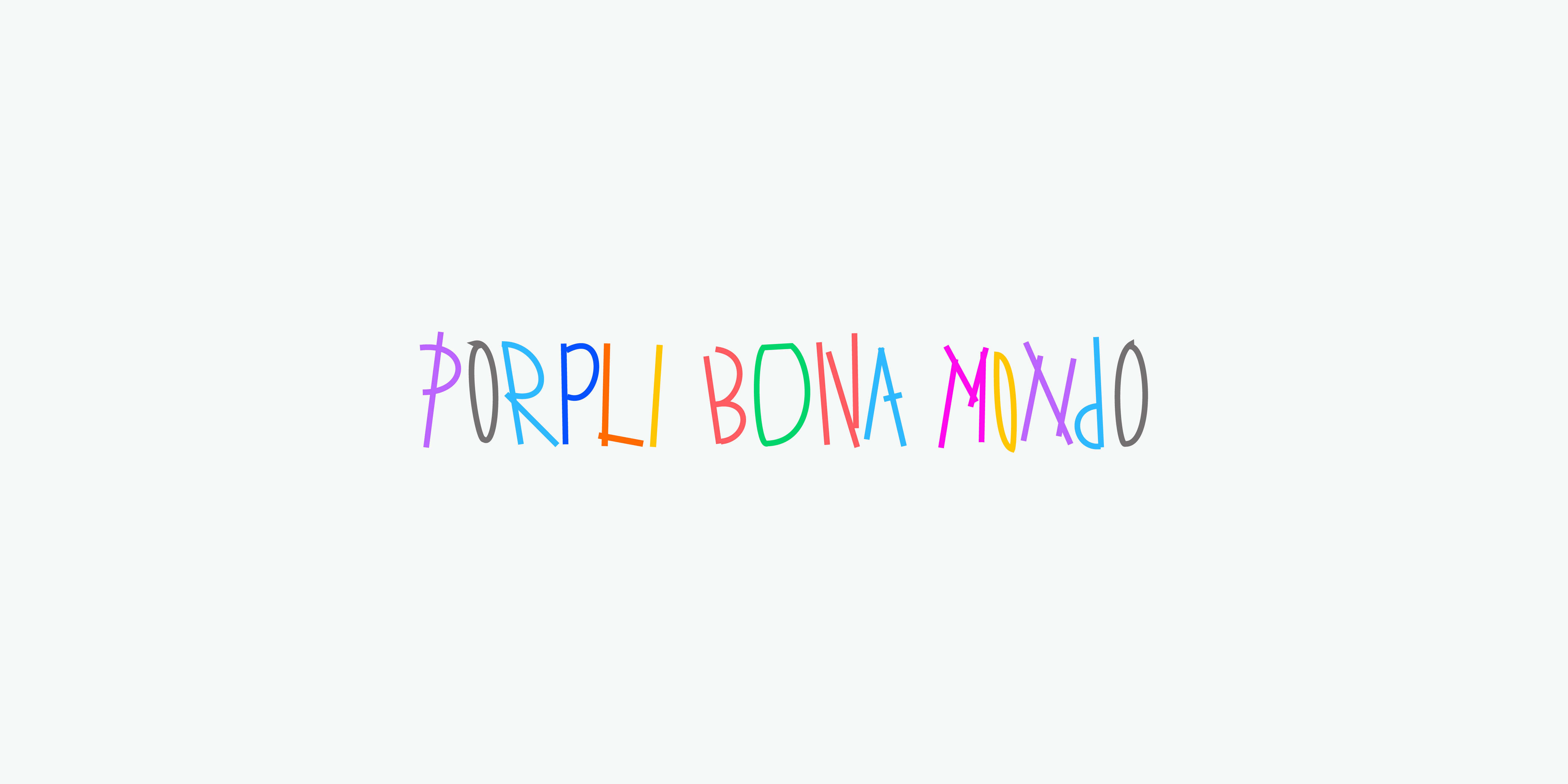
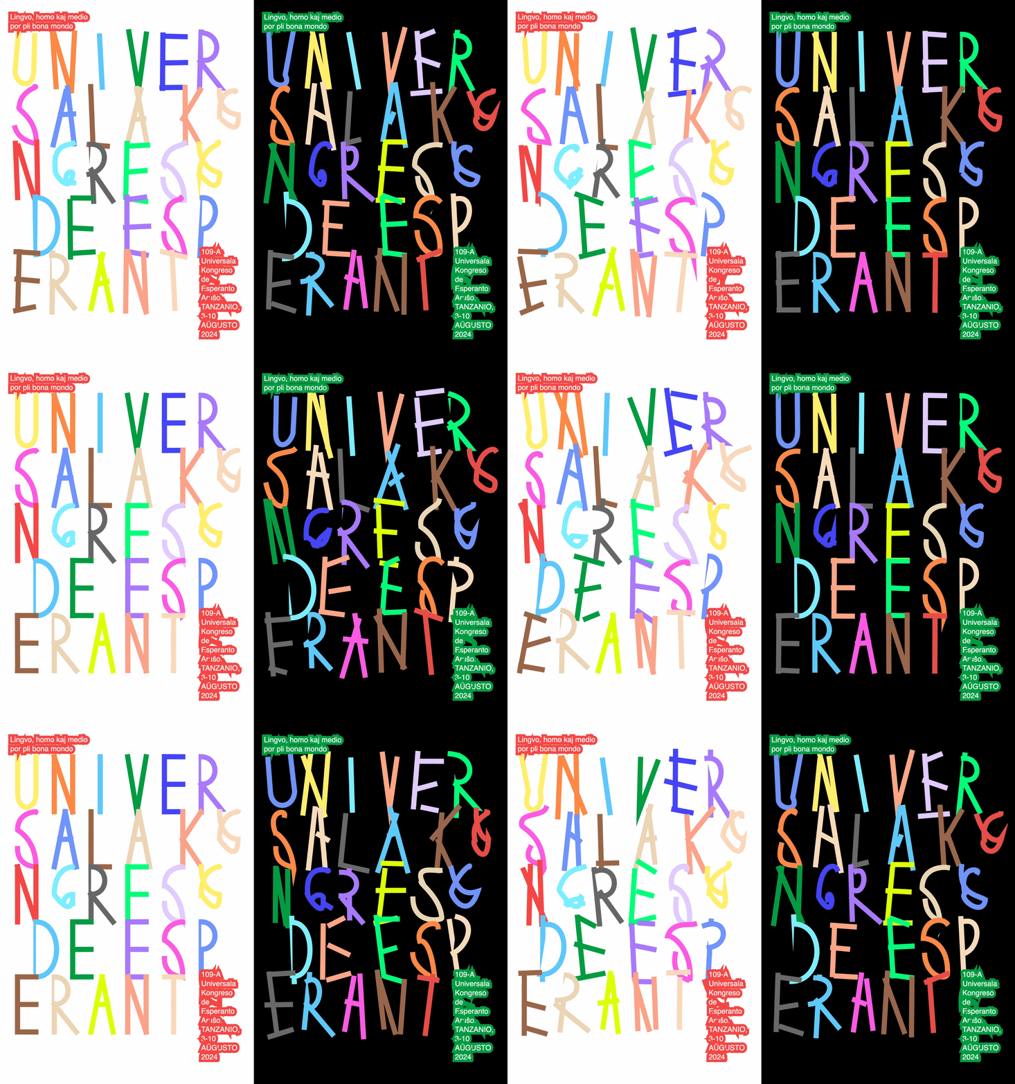
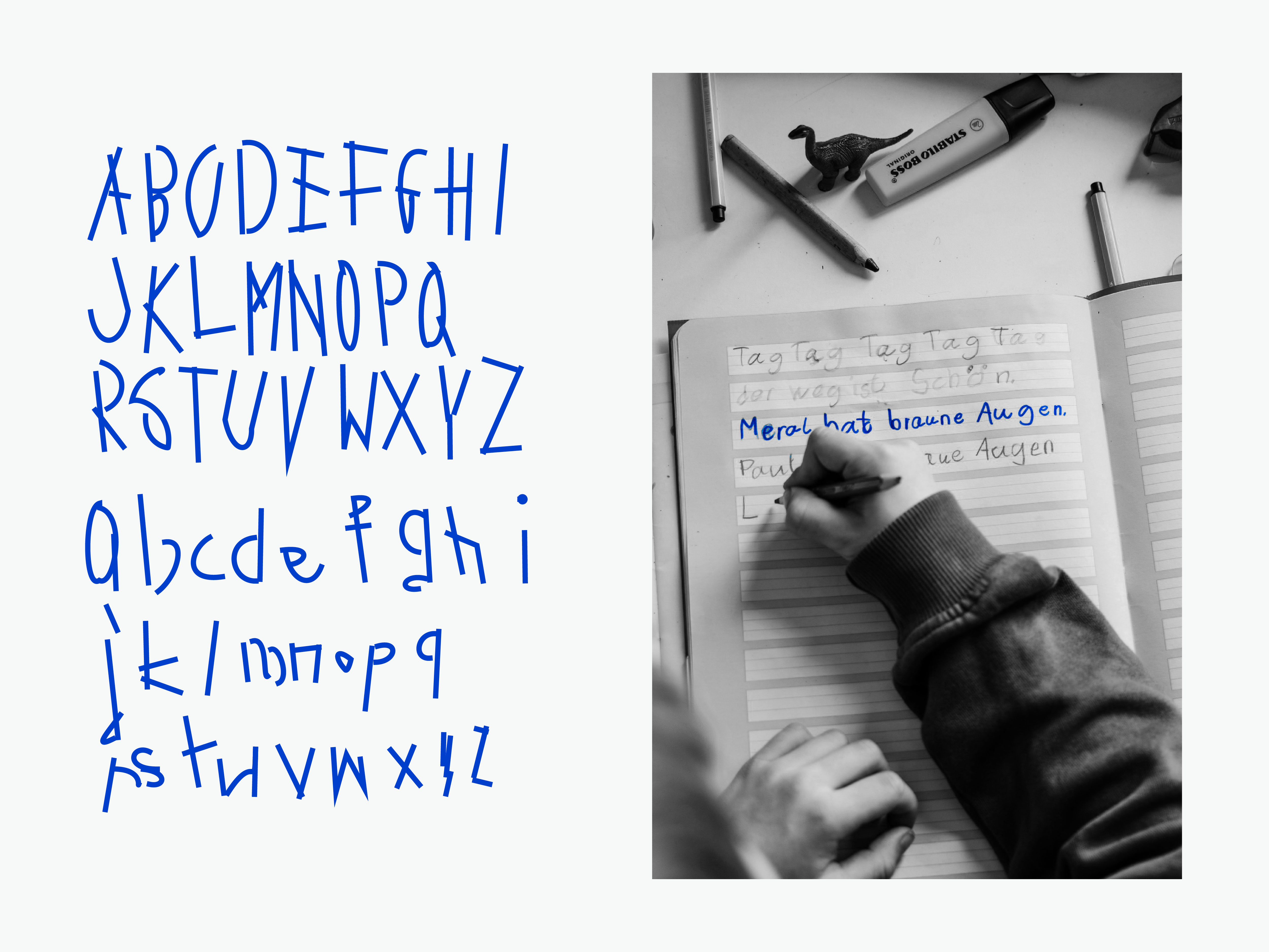
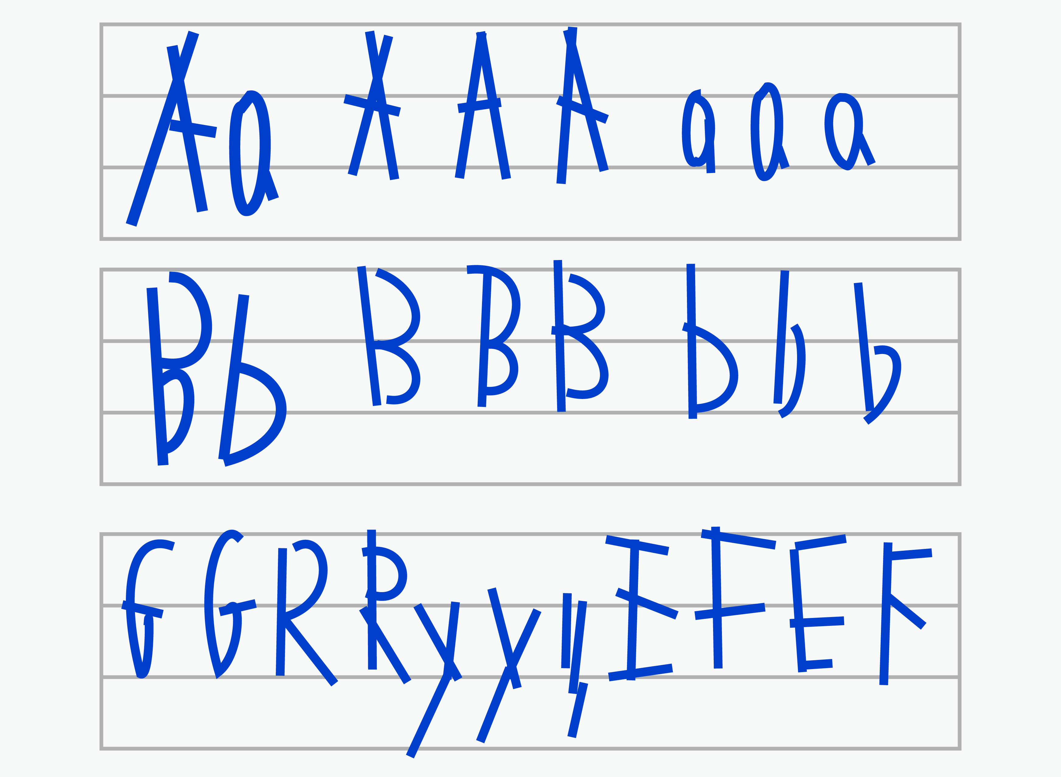
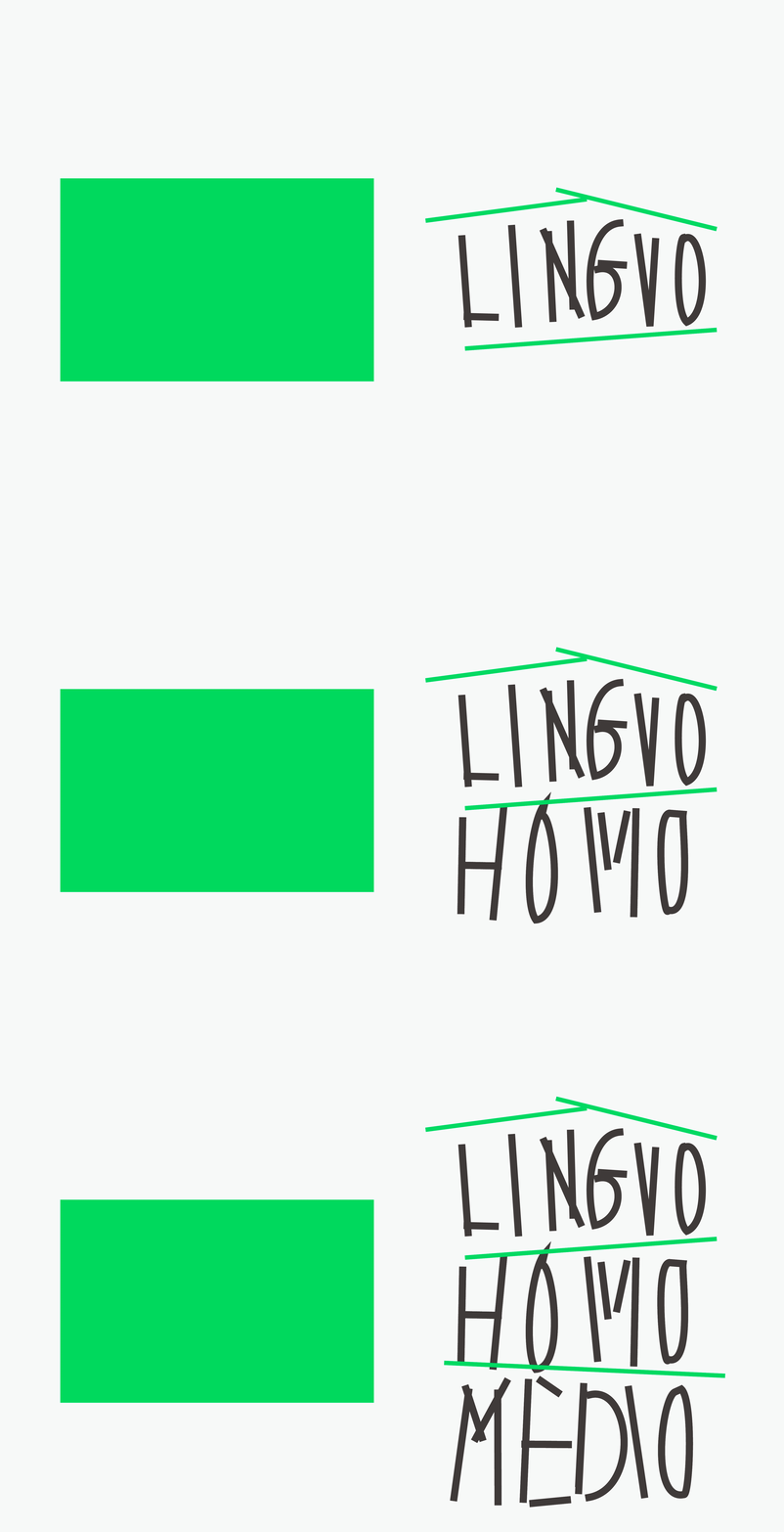
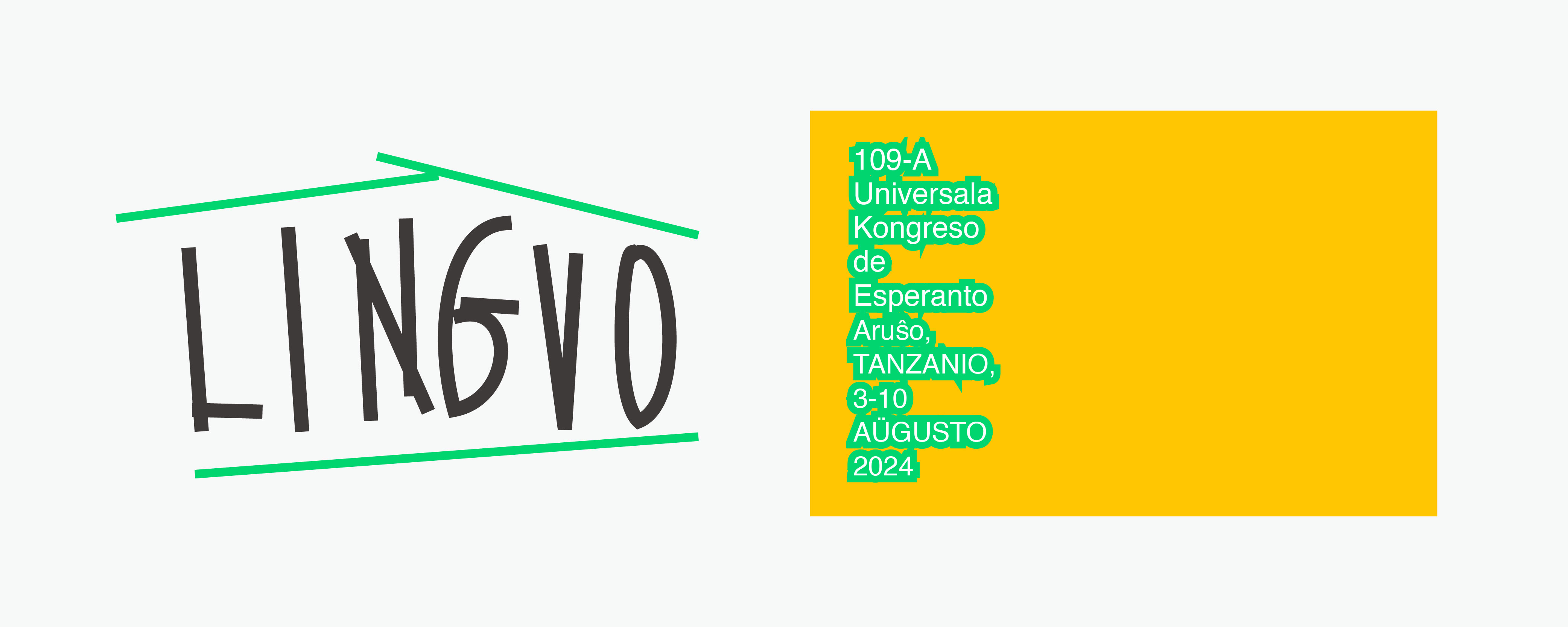
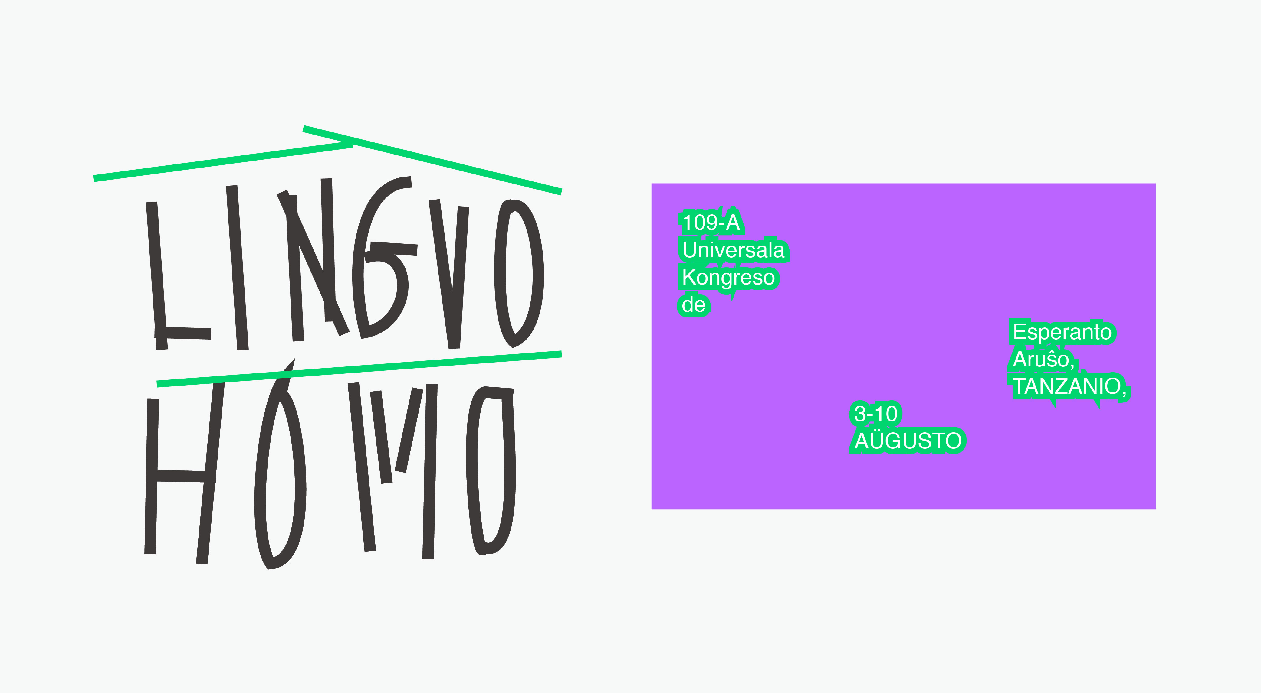
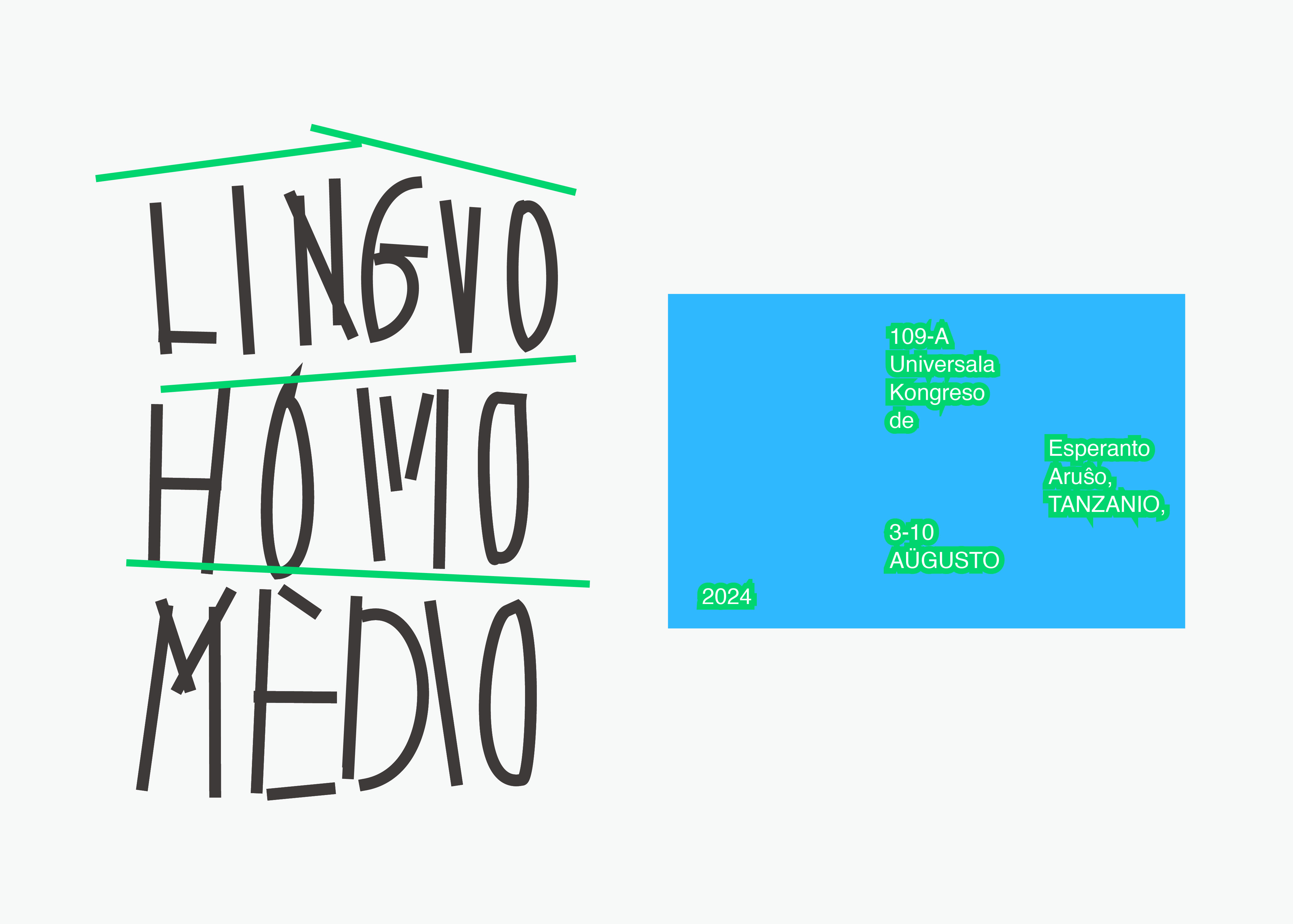
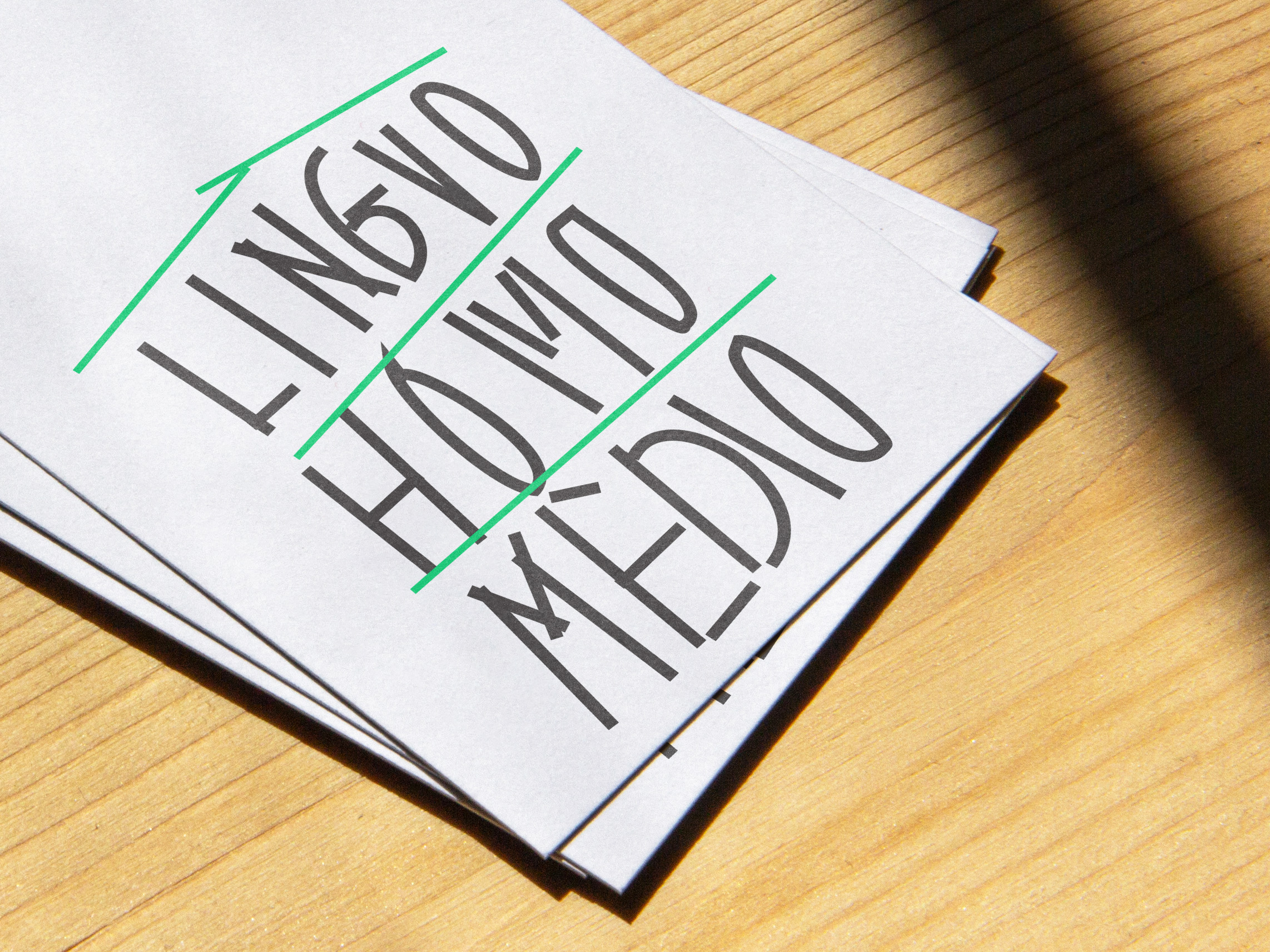
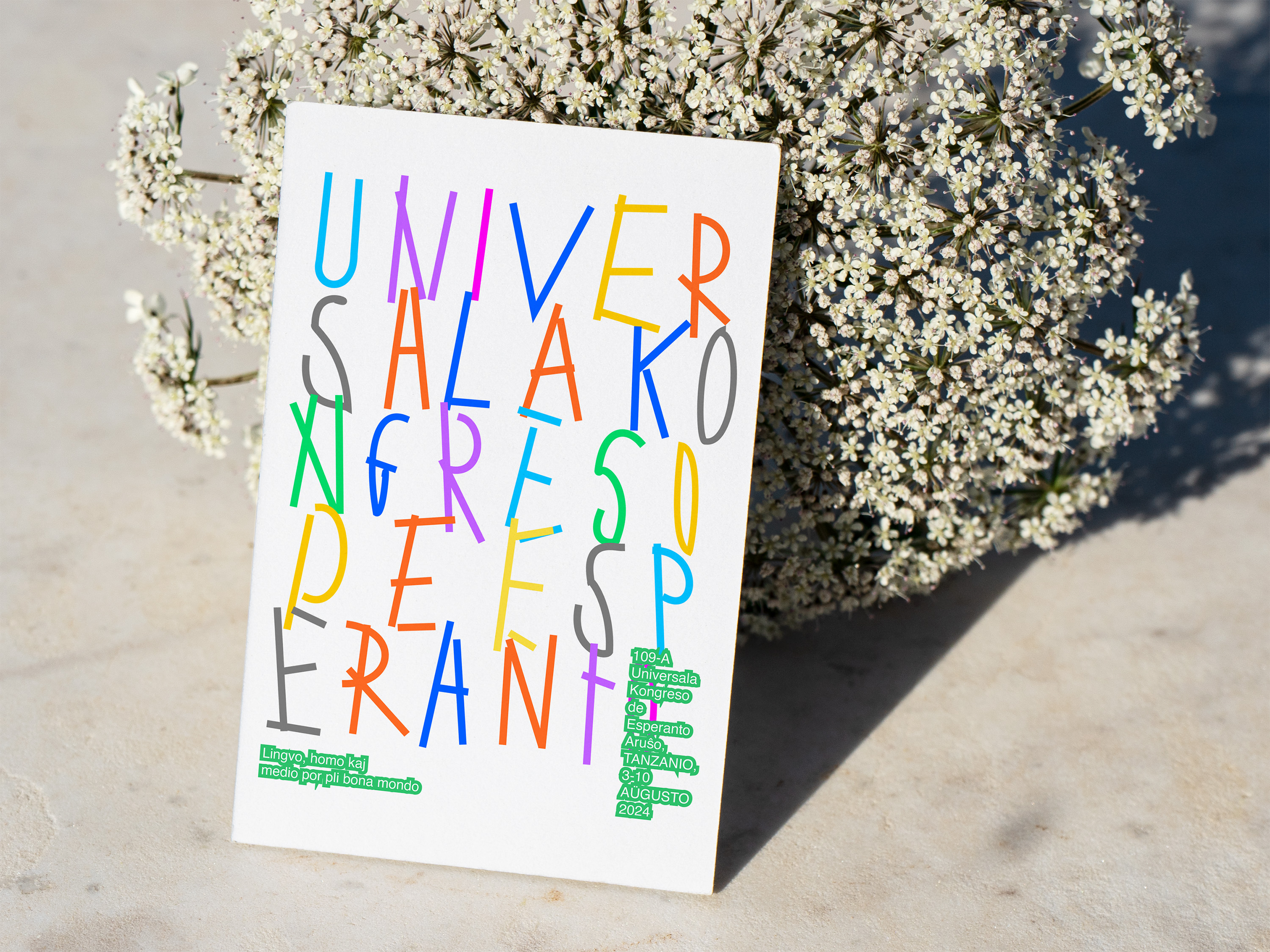
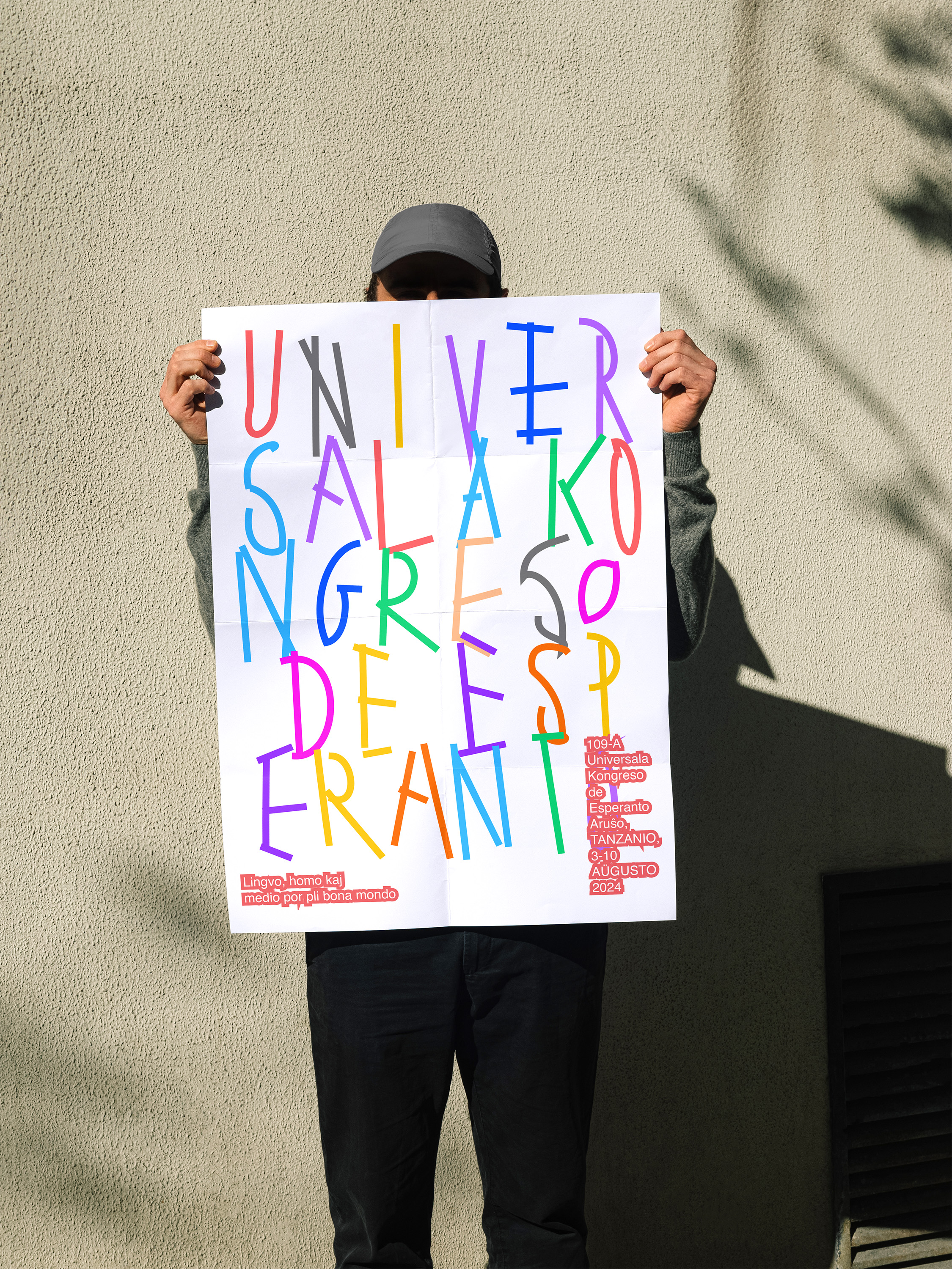
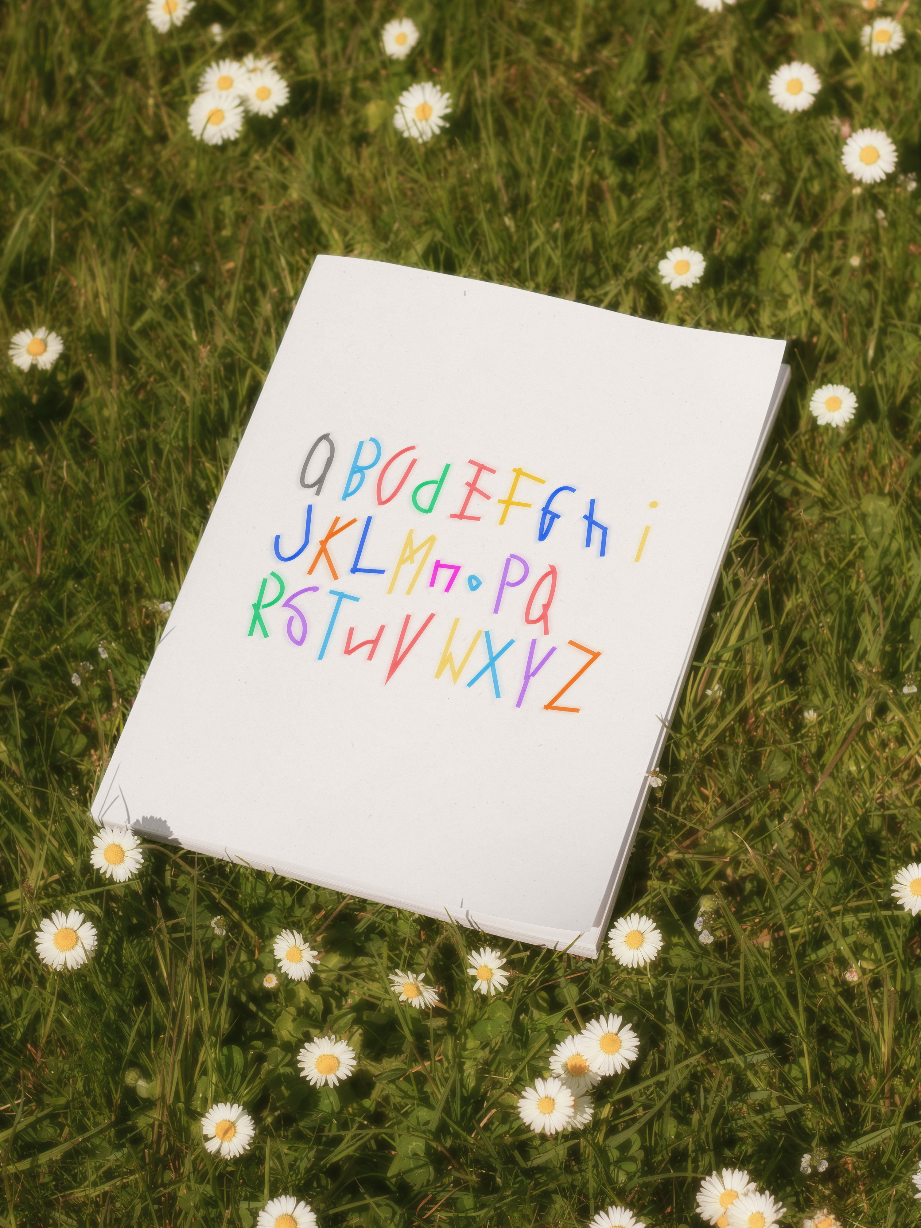
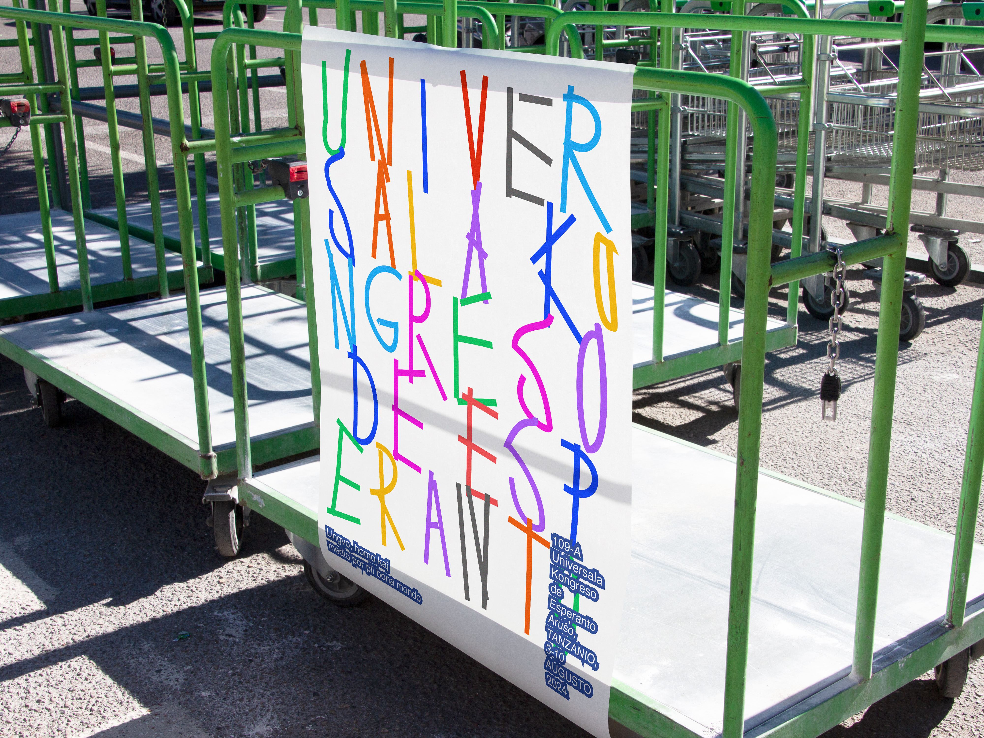
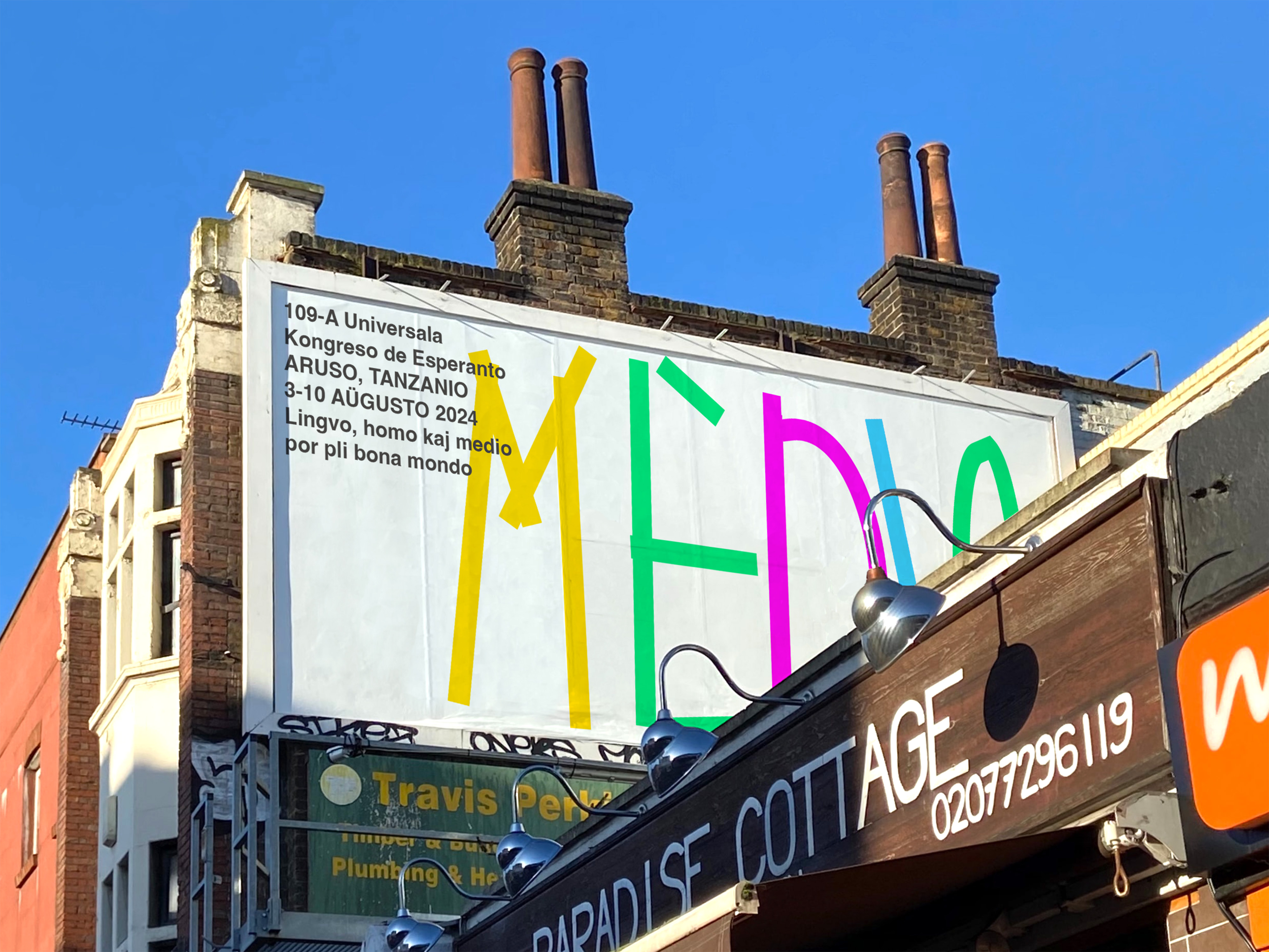
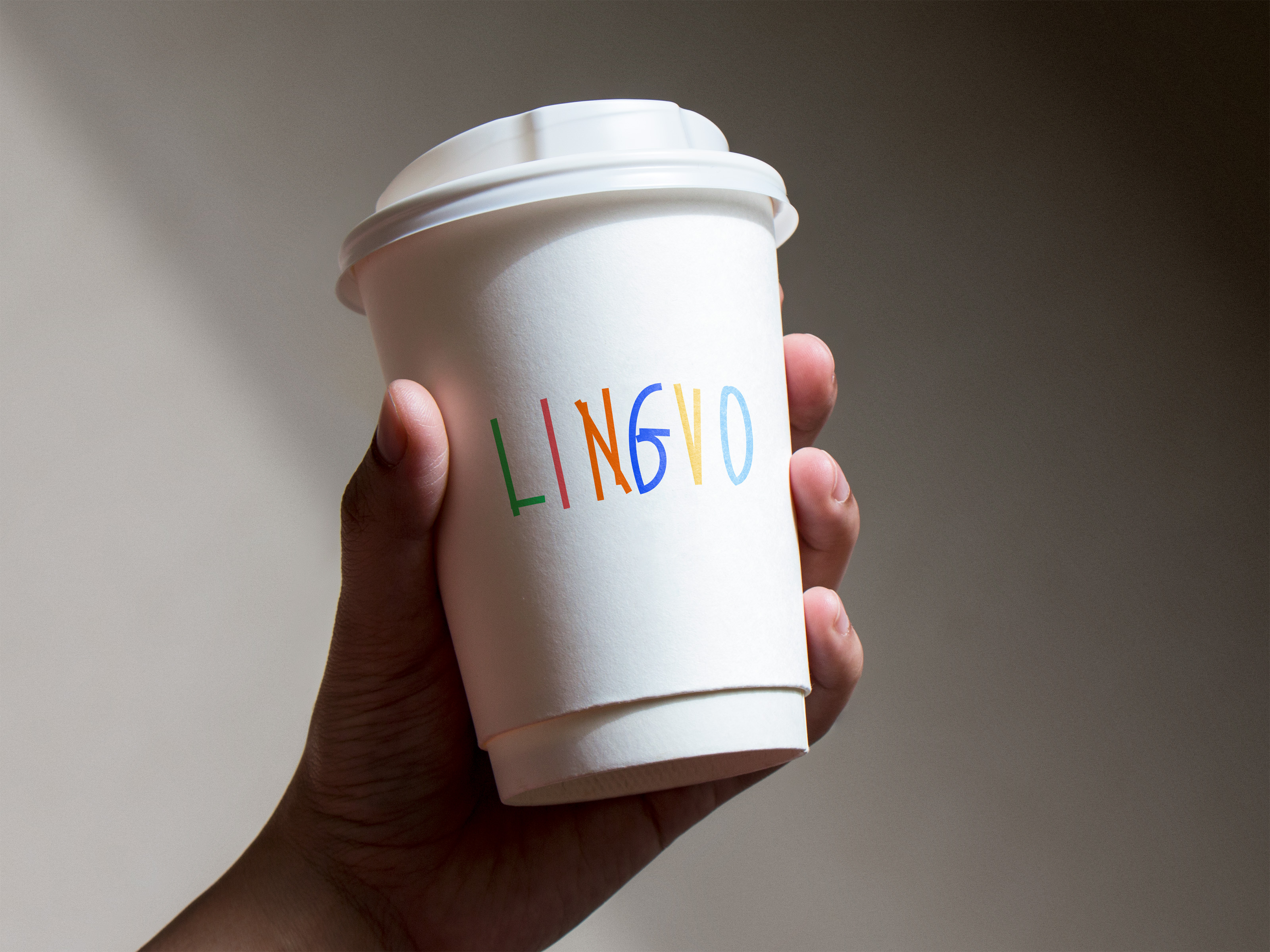
世界语是一种中立的国际语言,旨在促进不同文化之间的平等交流和理解。它就像一座桥梁,连接着来自不同语言和文化背景的人们,为他们提供了一个共同的交流平台。这一设计通过对字母表的趣味再创造,体现了世界语的包容性和多样性。它就像一个孩子未经雕琢的笔迹,不受语言障碍的限制,充满潜力。
对字母的重新诠释不仅仅是为了美观。它象征着一种对脆弱的刻意拥抱,而这种特质往往与童年的天真无邪联系在一起。然而,这种脆弱并不是软弱的象征,而是真实和开放力量的证明。通过拥抱不完美和承认我们理解中的差距,我们为真正的联系和有意义的对话创造了空间。
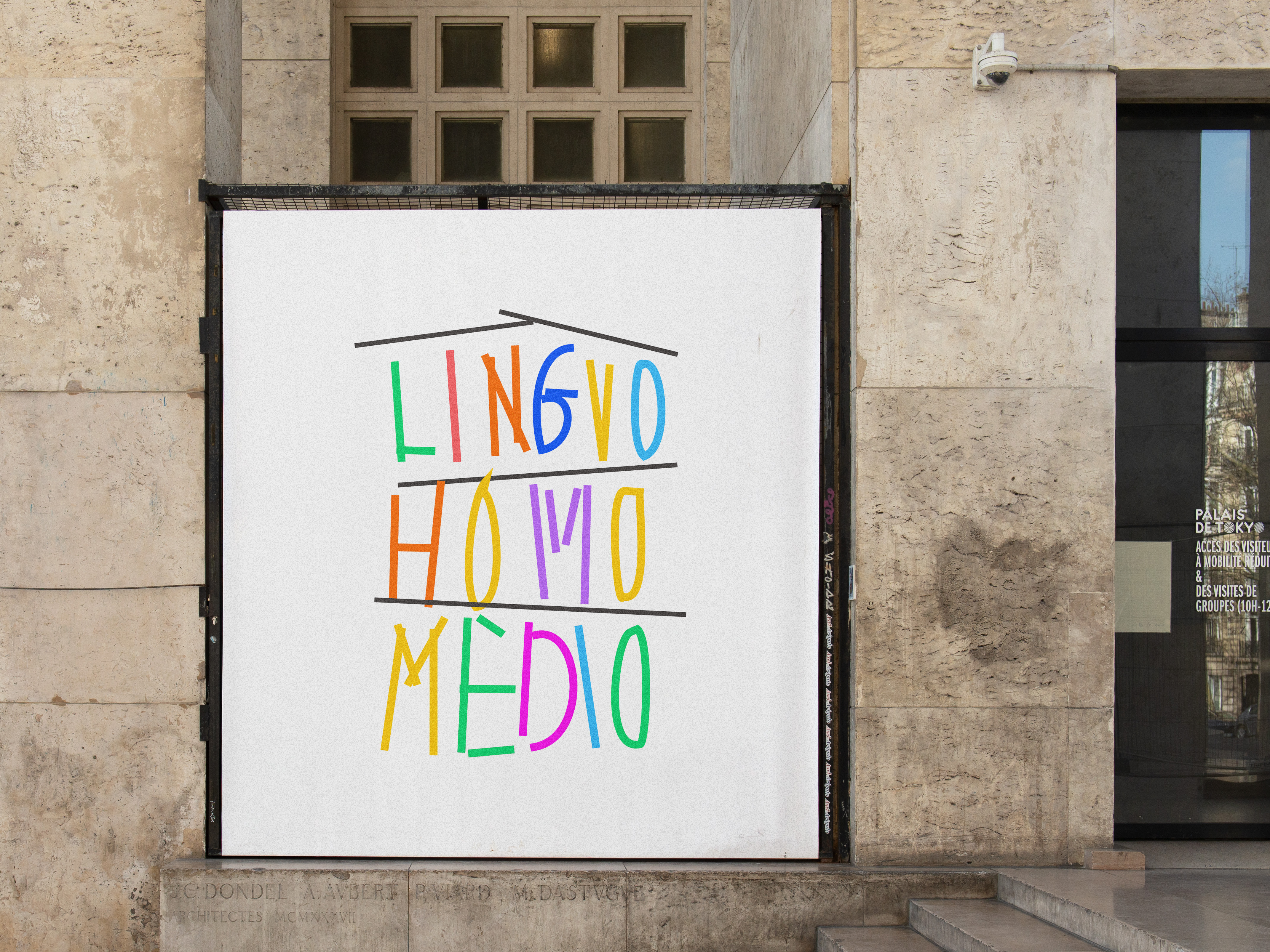
Esperanto, a neutral international language, aims to foster equal communication and understanding between different cultures. It serves as a bridge, connecting people from diverse linguistic and cultural backgrounds, offering them a common platform for communication. This design, through its playful reimagining of the alphabet, reflects the inclusiveness and diversity of Esperanto. It is like a child's unrefined handwriting, unrestricted by language barriers and brimming with potential. The playful reinterpretation of the alphabet extends beyond mere aesthetic appeal. It symbolizes a deliberate embrace of vulnerability, a quality often associated with childhood innocence. This vulnerability, however, is not a sign of weakness but rather a testament to the power of authenticity and openness. By embracing imperfection and acknowledging the gaps in our understanding, we create space for genuine connection and the possibility of meaningful dialogue.
Esperanto, a neutral international language, aims to foster equal communication and understanding between different cultures. It serves as a bridge, connecting people from diverse linguistic and cultural backgrounds, offering them a common platform for communication. This design, through its playful reimagining of the alphabet, reflects the inclusiveness and diversity of Esperanto. It is like a child's unrefined handwriting, unrestricted by language barriers and brimming with potential. The playful reinterpretation of the alphabet extends beyond mere aesthetic appeal. It symbolizes a deliberate embrace of vulnerability, a quality often associated with childhood innocence. This vulnerability, however, is not a sign of weakness but rather a testament to the power of authenticity and openness. By embracing imperfection and acknowledging the gaps in our understanding, we create space for genuine connection and the possibility of meaningful dialogue.
